Ryder Lease vs. Own
Cost Calculator
Learn moreEver Better
Campaign Microsite
Learn moreRyder Fuel Receipt
Mobile App
Learn moreMayfair Advisors
Real Estate Website
Learn moreEvolution of Ryder
Landing Pages & Emails
Learn moreWho is Eric Carr?
…and why you should work together
Who is Eric Carr?
Eric is a designer and manager with over 15 years of creative experience specializing in user experience design, product design, front-end web development, and digital marketing. He can design, code, and lead any project from initial concept to final product.
Why we should work together?
There’s no substitute for hard work. The most successful people throughout history have had one thing in common: the relentless pursuit of excellence in their craft. That’s exactly why Eric Carr spends every day investing in his passions for design and development. Although both of these fields require persistence in the face of constant failure, diligence is always rewarded with elegant solutions to difficult problems. Eric has spent the last 15 years in relentless pursuit of elegant solutions creating websites, emails, web and mobile applications, advertisements, and products — solving problems of all different types for companies of all different sizes.
Here are a few reasons why Eric Carr may be the solution you’ve been looking for:
Adaptability
Software, coding languages, and even how people work is constantly evolving. Not one for complacency, Eric is always in a future forward state of mind seeking out and learning the latest technologies. Naturally, this approach extends to his work with clients. For example, he joined Ryder in 2015 to fulfill a Digital Designer role, ended up filling a need for the latest digital technologies, and created a role as Senior UX Designer/Front-End Developer, which has continued to evolve into a management position.
Teamwork
Eric has worked in various roles throughout his career: designer, developer, consultant, and project leader. He taps into his experience “working in the trenches” on a daily basis as a manager overseeing multiple projects with his team of designers and developers. He also really enjoys working with young talent helping them realize their potential.
Dependability
The greatest compliment Eric likes to receive is a sigh of relief. This is what panicked directors with a lot to lose often give him when they realize he is leading a highly visibile project. He's never let anyone down, nor does he plan to start. Trust is hard earned these days and Eric is someone you can rely on to get the job done.
Ultimately, Eric Carr's goal is to help you and your company succeed with elegant solutions. All he needs is one chance to prove it.
Soft Skills
- Problem-Solving
- Project Leadership
- UX/UI Design
- Front-End Web Development
- Print & Digital Design
Hard Skills
- HTML5 / CSS3 / Javascript
- Sketch / InVision
- Adobe CC
- Sitecore / Eloqua
- jQuery / Bootstrap
Recent Work Experience
Ryder
Manager - UX & Front-End Development
3/2015 – present
- Served as creative lead on hundreds of digital projects while managing several junior and mid-level designers
- UX/UI design for a multitude of SaaS products, mobile apps, e commerce websites, and specialized landing pages
- Streamlined Marketing department’s production process by introducing more efficient practices
- Optimized, redesigned & coded 4 generations of digital campaign communications from scratch
Brains On Tap, LLC.
Designer / Developer
8/2014 – present
- Managed and executed a variety of projects from conception to completion
- Designed everything from websites, emails, and logos to product packaging, promotional materials, and an airplane livery
- Produced award-winning work for clients that increased engagement and sales
Marca
Art Director
1/2013 – 7/2014
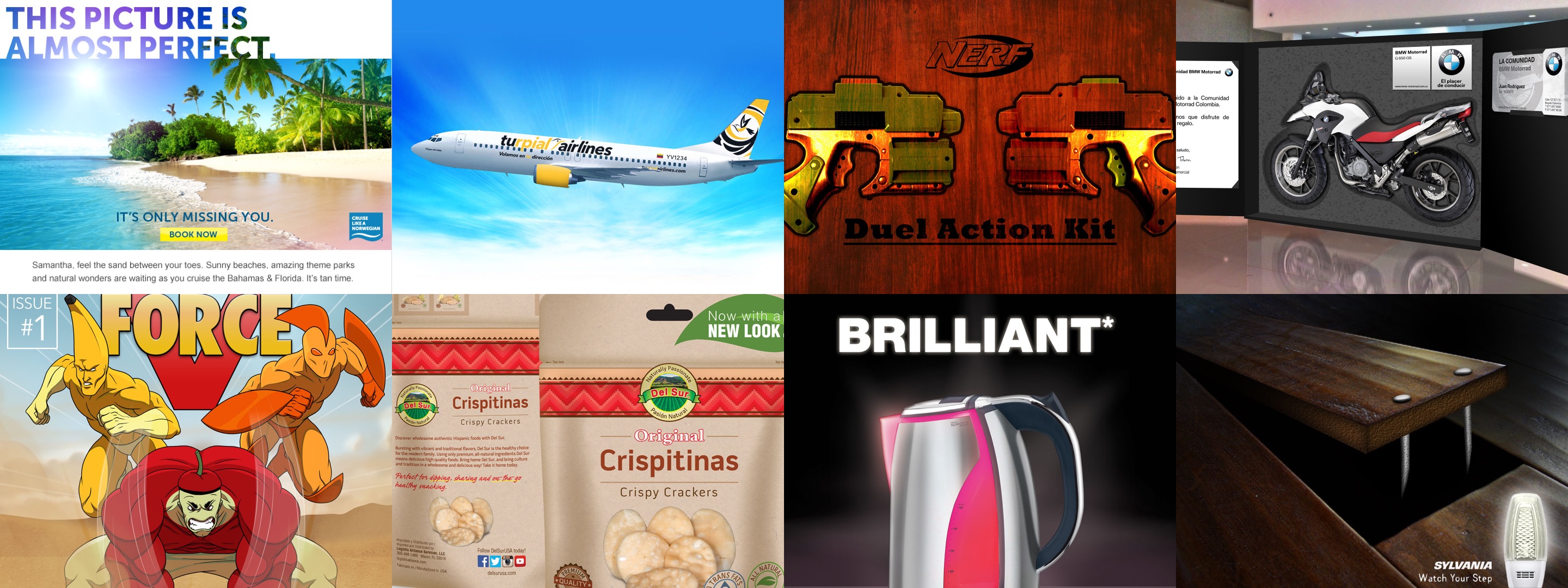
- Norweigan Cruise Lines: Designed promotional emails and landing pages
- Net10: UX/UI design for website redesign as well as design for digital promotions
- Created work in all forms for Dish, Tracfone, Rite Aid, H&R Block, and Breville
Education
- Miami Ad School - Art Direction
- UNC-Charlotte - Graphic Design
Leasing vs. Ownership
Total Cost Calculator
Ryder System Inc.
An industry leader in managing critical fleet, transportation, and supply chain functions for over 50,000 customers.
Challenge
Owning and operating a fleet is expensive and fraught with costly drawbacks: purchasing trucks, routine maintenance, employing drivers, federal compliance, among others. Many potential customers might not even realize how much their fleets costs until they crunch the numbers. How can current and potential customers easily calculate this information? And how can Ryder capitalize on these results?
Audience
Operations Managers for companies of various sizes that are looking to cut costs and alleviate certain burdens of owning and operating a fleet.

Key Skills Demonstrated
- UX Design: Optimized user flows for ease of use and maximum engagement
- Web Development: Coded product using HTML5, CSS3, and Javascript
- Leadership: Led project from initial concept to finished product
- Consistency: Future forward design using Ryder brand standards
- Efficiency: Implemented lean coding practices for speed and compliance
- Cost-Effectiveness: Produced final product with basically no budget
Team
- Me: UX Designer / Front-End Developer
- Kevin Sheedy: Director of Sales Operations
- Michael Dill: Copywriter
- Eliana Simon: Segment Marketing Manager
- Nadira Ramatally: Marketing Automation Manager


Process
1
Research

Worked closely with the Director of Sales Operations to establish an accurate data model as well as mathematical formulas for proper calculations.
2
Wireframes

Created wireframes to optimize the user journey and provide a seamless experience. After several iterations, the most ideal approach was established.
3
Mock-ups

Designed low and high‑resolution mock‑ups in Sketch. During this process a step‑by‑step system was implemented to ease the data entry process.
4
Prototypes

Constructed a working prototype using InVision to demonstrate how users would interact with the site.
5
Development

Page was coded using latest techniques and practices. Most notably, Javascript was used for all of the calculations and implementation of data.
6
Testing

When the site was ready, it was repeatedly tested and thoroughly broken until all of the bugs and missteps were caught and corrected.
7
Final touches

Form validation was enhanced to further ease the process of data entry for users. Also, the site was routinely made fully accessible and compliant for all users.
8
Release

Final product was given a vanity URL for easy access and linkability before a full email campaign was deployed to steer the target audience to the site.
3 Lessons In Practice
Make It as Easy as 1-2-3
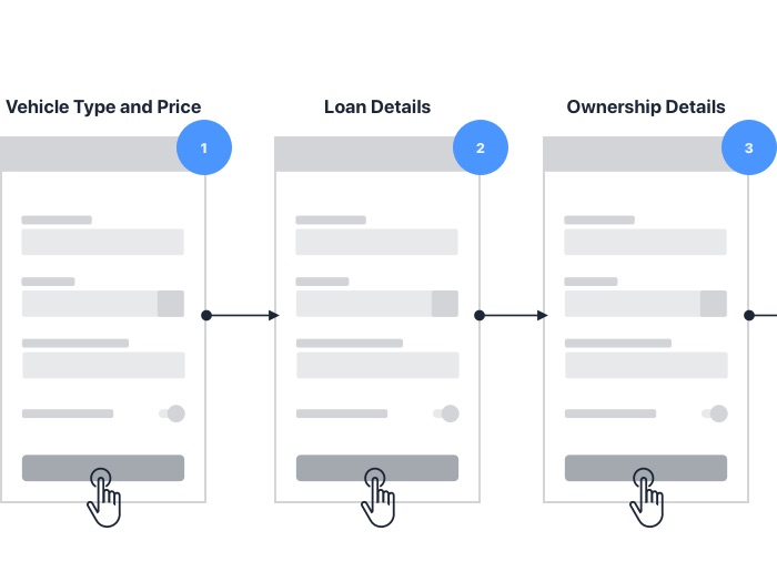
The data needed to provide an accurate estimate requires the user to fill out at least seven input fields. (Ten, if a loan is involved.) In order to not overwhelm and, ultimately, discourage users, the process was broken down into three easily digestible steps:
- Vehicle type and price
- Loan information (if applicable)
- Ownership details
Let Validation Be a Guide
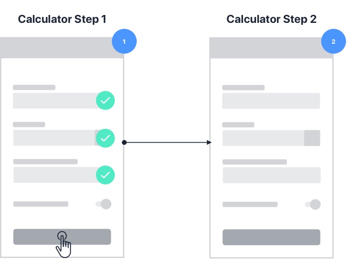
Since the user exclusively interacts with the calculator, it’s essential that it helps them quickly provide accurate data. This was done by enhancing the validation process. Buttons are rendered inactive until all of the necessary data is provided. Also, some users won’t have some specific information readily available so average value estimates are included above the input field based on their current calculations. This simultaneously alleviates guesswork, manages expectations, and moves the user along closer to completion.
Customize the Outcome
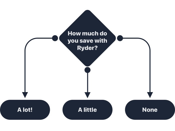
The final goal of providing a user with their total cost of ownership is to get them actively thinking about their current costs. This is great opportunity to show them how much they could be saving with Ryder’s Full Service Lease program. But this all depends on how their grand total stands up against the industry benchmarks, so three different sales pitches were constructed based on their results:
- You could save a lot of money by switching to Ryder
- You could save some money by switching to Ryder
- You’re doing pretty well, but we could still help with other costs
Ever Better
Campaign Microsite
Ryder System Inc.
An industry leader in managing critical fleet, transportation, and supply chain functions for over 50,000 customers.
Challenge
Sometimes it takes a global pandemic to demonstrate just how crucial supply chains are to the world’s economy. Strong ones boost profits while weak ones break businesses. What better time to make customers aware of how Ryder can strengthen their bottom line in both good times and bad?
Audience
Operations Managers for medium to large-sized companies that are currently reevaluating or reconsidering their supply chains.

Key Skills Demonstrated
- UX Design: Optimized user flows for ease of use and maximum engagement
- Web Development: Coded product using HTML5, CSS3, and Javascript
- Integration: Matched site with branded full 360º campaign (TV/print/digital)
- Teamwork: Syncronized all moving parts of campaign to reach deadline
- Efficiency: Implemented lean coding practices for speed and compliance
- Speed: Nimbly executed project on tight timeline
Team
- Me: UX Designer / Front-End Developer
- Michael Dill: Copywriter
- Luis Davila: Graphic Designer
- Ana Hernandez: Senior Manager Segment Marketing
- Philip Kassar: SEO Manager
- Luke Hsu: SEO Specialist
- Amanda Celestin: Marketing Automation Analyst


Process
1
Research

Worked closely with the project stakeholders and team members to establish desired targets, timeline, scope, goals, and deliverables for ad campaign.
2
Wireframes

Created wireframes to optimize user journey and provide a seamless experience to display five categories of products. The most successful practices from past campaigns were integrated into the microsite.
3
Mock-ups

Designed low and high-resolution mock-ups in Sketch. It was essential that all elements (ads, tv spot, emails, microsite) aligned visually for full synchronicity.
4
Prototypes

Created a working prototype in InVision to demonstrate how the user would interact with the site.
5
Development

Pages were coded using HTML, CSS, and Javascript, implementing recent and most efficient practices.
6
Testing

Once the site was ready. It was repeatedly and thoroughly broken, visually and tactically, until all of the bugs and snags were caught and corrected.
7
Final touches

Validation, tracking, and web accessibility practices were utilized and tested.
8
Release

Final product was given a vanity URL for easy access and linkability before the full campaign was launched.
3 Lessons In Practice
Campaign Unity

A full-fledged ad campaign’s success relies on being completely cohesive and seamless to its target. Print ads, digital banners, emails, and the microsite all came together under an established branded design theme. This couldn't have happened without the coordination of the entire team.
Don’t Sell Too Hard

One fact about Ryder customers is they don't like prominently featured forms if no context has been established beforehand. With this in mind, success has been found with strategically placed CTA buttons that trigger a modal that reveals the form front and center. This strategy, combined with fixing a CTA to the bottom of the browser in mobile formats, has proven to be the most effective way to increase form completions.
A Page For Everyone

Most people don’t know that Ryder does more than rent trucks. This ad campaign was constructed to educate potential customers that Ryder does so much more: supply chain optimization, logistics, e-commerce, and last mile delivery. Each category represented on this microsite had its own respective set of ads and traffic.
Results
89%
increase in leads since the launch of the campaign on July 28th
40%
increase in overall traffic to ryder.com since the launch
$53M
in pipeline influence
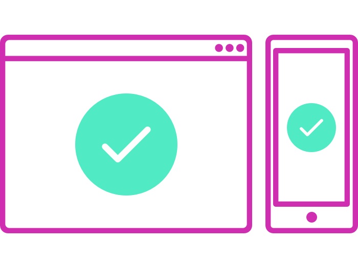
Ryder Fuel Receipt
Mobile App
Ryder System Inc.
An industry leader in managing critical fleet, transportation, and supply chain functions for over 50,000 customers.
Challenge
All drivers were required at one time to report fuel purchases made at non-Ryder fueling locations. This practice led to bundles of unorganized paper receipts piled on various desks in the accounting department. How can we spare both the drivers and the accountants from the burden of physical receipts?
Audience
Drivers on the move that collect printed fuel receipts for bi‑monthly reporting.

Key Skills Demonstrated
- UX Design: Optimized user flows for ease of use and maximum engagement
- Leadership: Led project from initial concept to developer hand-off
- Consistency: Created and followed brand guidelines precisely
- Teamwork: Effectively worked and coordinated with off‑site external developer
- Cost‑Effectiveness: Got the job done with virtually no budget
Team
- Me: UX Designer
- Misael Quintana: Digital Designer
- Neto Muraoka: IT Manager - Development
- Rubik Force: Development Team
- Romain Rousseau: Marketing Manager - Digital
- Kathy Tuaño: Project Manager
- Ana Hernandez: Marketing Manager - Digital Content Delivery

Process
1
Research

Worked closely with the stakeholders to completely understand accounting system and how drivers submitted their documents.
2
Wireframes

Created wireframes to optimize the user journey and make the experience quick and seamless for drivers.
3
Mock‑up/Prototype

Designed low and high‑resolution mock‑ups in Sketch. Working prototype was constructed in InVision for testing.
4
Test & Release

Prototype was thoroughly tested before final working files, design, and CSS guidelines were released to the developer. Alpha and beta testing was done with mobile application in the field with user test group.
3 Lessons In Practice
Make It as Easy as 1-2-3

Inputting detailed information is tedious. Breaking this process down into easily digestible steps was crucial for form completion. The process was broken down into simple steps requiring only essential information:
- Enter/verify your vehicle information
- Take a picture of the receipt
- Provide specific details (price, total gallons, total cost, and state)
Finally, the information is confirmed and submitted with one touch.
On the Move

It's no secret that drivers are always on‑the‑go and the entire process was constructed to be done on the fly in the parking lot. The user test group averaged 30 seconds per receipt. And after the receipt was submitted it could be discarded.
Taken Into Account

Needless to say, the biggest winners were those in the accounting department. Not only were they relieved of tallying a pile of receipts manually by calculator, but all of the receipt information was neatly provided in a spreadsheet.
Mayfair Advisors
Real Estate Website
Mayfair Advisors
A Miami‑based real estate firm located in Coconut Grove that specializes in high‑end luxury homes in desired neighborhoods.
Challenge
On the surface, high‑end luxury real estate is a high stakes industry where sleek presentation can translate into multi‑million dollar deals. But underneath it all, real estate is about getting viable leads and selling properties. What kind of website would accomplish both while establishing an upcoming local brand?
Audience
Wealthy international buyers looking to invest in high‑end South Florida real estate properties.

Key Skills Demonstrated
- UX Design: Customized brand guidelines, user flow, wireframes, and design system
- Leadership: Led project from initial concept to developer hand-off
- Teamwork: Coordinated with off-site external developement team
- Cost-Effectiveness: Efficiently executed quickly under budget
Team
- Me: UX Designer
- Fabio Ianelli: Director of Technology, ADVANSIS
- Thiago Rodriguez: Head of Development, ADVANSIS
- ADVANSIS Development Team


Process
1
Research

Studied and researched the most successful real estate and e‑commerce websites, both general and niche, noting best practices and elements.
2
Wireframes

Created wireframes to optimize the user journey. Also, utilized an e‑commerce approach to feature and search properties.
3
Mock‑up/Prototype

Designed low and high‑resolution mock‑ups in Sketch. Working prototypes were constructed in InVision for demonstration.
4
Release

Prototypes were thoroughly tested before final working files, design, and CSS guidelines were released to the developer.
3 Lessons In Practice
You Gotta See It To Believe It

When it comes to browsing real estate on the internet, nothing does more to pique one's interest than beautiful images of a property. Strangely enough, I discovered through my extensive research that complementary images were rather hard to come by at that time, even on the websites of industry leaders. After this baffling revelation, I recommended that all of the listings on the website be shot exclusively by a professional photographer shoot to make each property literally look like a million bucks.
E-Commerce Approach

After examining several real estate websites, I quickly discovered they had an outdated approach. Their home pages were basically "About Us" pages with a phone number and when it came to searching properties they all used the same MLS (Multiple Listing Service) API that was wrought with inaccurate, incomplete information and unsavory images.
This discovery inspired me to take a transactional e‑commerce approach that highlighted new and exclusive properties much like an e‑tailer would feature products. In lieu of a monetary transaction, the goal was to get a user to schedule a viewing or attain a bankable lead. With a collection of professional images integrated into a curated database of Mayfair Advisor's available listings, the site would put properties first, which is where the users' interests truly lie.
Location, Location, Location
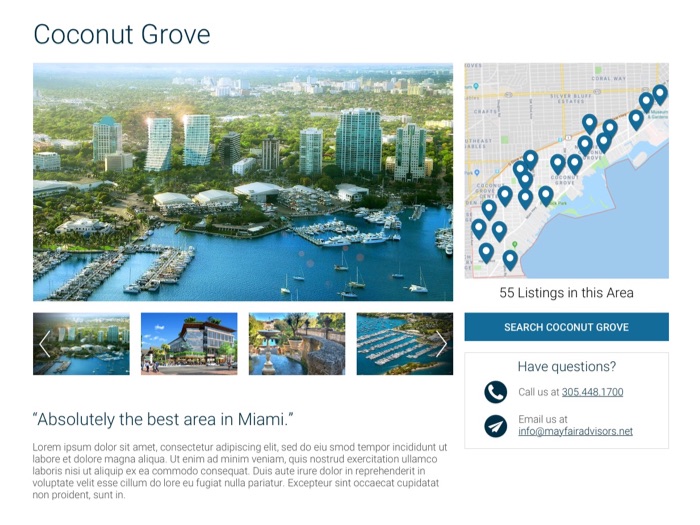
When it comes to properties, location is the most important detail. Properties in desired neighborhoods are safe with great amenities and schools nearby, which drive their value and make them amazing investments. Since communities drive many real estate decisions, a "Communities" feature was designed to allow users to not only learn more about desirable communities in South Florida, but also browse local listings while learning more about surrounding restaurants, parks, local school systems, and more.
The Evolution of Ryder
Lead Generation Digital Collatoral
Ryder System Inc.
An industry leader in managing critical fleet, transportation, and supply chain functions for over 50,000 customers.
Challenge
Revenue growth in any service industry depends not only on gaining new customers, but also expanding services provided to current clients. Ryder uses strategically targeted campaign emails and landing pages to generate leads. How can Ryder exceed their goals effectively year after year?
Audience
This varies based on product or industry being promoted, but most likely operations managers of companies of various sizes that depend on an efficient supply chain and/or a fleet of vehicles.
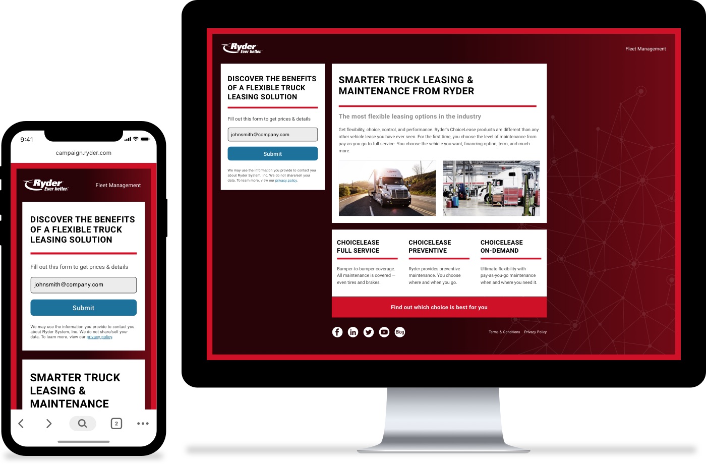
The fourth and latest generation of campaign landing page in desktop and mobile formats
Key Skills Demonstrated
- UX Design: Optimized user flows and designs for ease of use and maximum engagement
- Web Development: Coded emails and landing pages using HTML5, CSS3, and Javascript
- Leadership: Led project from initial concepts to finished products
- Consistency: Evolved and enhanced branded design themes over time
- Productivity: Created templates for fast implementation, even by novice coders
- Cost-Effectiveness: Got the job done every time with virtually no budget
Team
- Me: UX Designer / Front-End Developer
- Misael Quintana: Digital Designer
- Michael Jimenez: Digital Designer
- Philip Kassar: SEO Manager
- Luke Hsu: SEO Specialist
- Nadira Ramatally: Marketing Automation Manager
- Amanda Celestin: Marketing Automation Analyst
4 Iterations of Digital Campaigns
Emails
Desktop

Mobile

Landing Pages
Desktop

Mobile

Emails
Desktop

Mobile

Landing Pages
Desktop

Mobile

Emails
Desktop

Mobile

Landing Pages
Desktop

Mobile

Emails
Desktop

Mobile

Landing Pages
Desktop

Mobile

Process
1
Research

Worked with SEO Manager, SEO Specialist, and Marketing Automation Managers to find the most effective elements and strategies using Google Analytics and Oracle Eloqua.
2
Wireframes

Inspired by new insights and user data, new wireframes were designed and structured to include all necessary elements and utilize most successful practices.
3
Mock-ups

My team of three designers and I mocked up various design themes in Sketch, aiming for a fresh look by pushing the boundaries of what came before.
4
Prototypes

Favored design themes were further developed into full‑fledged low and high‑resolution designs before being presented to the Marketing team.
5
Development

Two design theme finalists were chosen by the Marketing team and implemented in A-B tests over a full sales quarter.
6
Testing

The winning design was developed into a series of templates built with reusable components to accommodate any promotion.
7
Final touches

All emails and landing pages were meticulously tested on devices of all types as well as on multiple browsers via Email On Acid and BrowserStack.
8
Release

Final deliverables were made available to all designers and developers for implementation.
The Template System
When I first started, every email and landing page was designed in Photoshop and essentially coded from scratch, while being submitted to several rounds of approval before deployment. This inefficient process required at least two full work days to complete one campaign. This all changed when I established a new template system.
Brand Guidelines
First, brand guidelines were needed to create common ground for all designs and establish proper practices for typography, colors, iconography, and components. This was not only essential for in‑house designers and developers, but an invaluable resource for third-party vendors.
Diligent Design
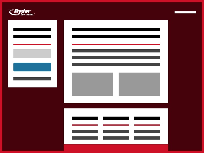
Next, a Sketch file template was constructed that included all commonly used campaign emails and landing page layouts. Additionally, all approved branded photography, icons, and components were included in this file. Any designer could now swap out any component instantaneously, add approved copy, and incorporate feedback in a flash before uploading it to InVision for approval from all stakeholders.
Quick Coding
Finally, pre-coded templates that could accommodate any layout of email and landing page were integrated into our content delivery network, Eloqua, along with all icons, branded images, and CSS files. Replacing content from that point on became as easy as cutting and pasting a URL from a provided list of assets. Also, each template was coded to be 100% user compliant, compatible for all browsers (even IE), and easily updated with one upload.