DID YOU KNOW?
58%
of organizations manage pricing using home‑grown solutions with basic capabilities
A platform designed to help improve pricing and promotion decisions. Predictive technology, unified data, and actionable insights enable smarter decision‑making — and help drive higher profits and revenue.
Many companies don't have the skills, tools, or resources to accurately price their products. The impacts from pricing decisions are difficult to predict and can only truly be understood well after they've been executed.
Give clients a one‑stop shop SaaS application designed to easily find the best price — one that optimizes volume and profit, and serves as a bargain for customers — for their products.
Lead User Experience Designer
Team lead during the entire design process: user research, wireframing, prototyping, usability studies, and design mock-ups.
Our team conducted interviews with stakeholders as well as subject matter experts. Accumulating enough insights and data to create empathy maps to understand our users and design for their needs. A primary user group of potential power users was identified through our research: Pricing Leads, managers of pricing teams who are responsible for executing optimal prices for their organizations.
Sales Team Leads were established as a secondary user group because of their routine engagement with Pricing Leads. They are directly responsible for moving their designated products and regularly request pricing adjustments.
Product teams may be unable to monitor price performance of their products, which restricts their ability to identify the right product mix and explore drivers for low performing products.
Pricing teams may not have the right skills or capabilities to make smart, data‑driven pricing decisions.
Leadership struggles with the trade‑off between revenue growth and profitability.
of organizations manage pricing using home‑grown solutions with basic capabilities

I set pricing strategies while handling pricing escalation, and collaborate with other business units to ensure successful price execution.
Steven Brown is a 31-year-old Pricing Lead and potential daily Power User. He is responsible for setting pricing strategies that maximize value and align with corporate objectives. Steven and his pricing team regularly handle instances of pricing escalations and price adjustment requests from Sales.
Hometown: Pittsburgh, Pennsylvania
Family: Spouse, 2 Children
Primary task: Find an optimal price for a product after a price adjustment request.


I help reduce deal complexity, cycle time and actively support sales and marketing teams in closing deals.
Mikael Libera is an 36-year-old Sales Team Lead with a high business acumen and a penchant for closing deals. He is constantly negotiating deals alongside his team and has a deep understanding of complex deal structures. Mikael will regularly request price adjustments from Steven, the Pricing Lead, in order to move more product.
Hometown: Ft. Lauderdale, Florida
Family: Spouse
Primary task: Make a price adjustment to a product.

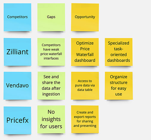
My team and I assembled an affinity map to organize the results of our competitive analysis into gaps left by the competition and opportunities presented by these gaps.
With the research complete and opportunities identified, it was time to start sketching screens. This step is crucial when it comes to the hierarchy of data and the utilization of specific charts. Since the proposed application would be accessing classified data on secured laptop and desktop machines via a browser, desktop screen sizes were deemed an ideal place to start.
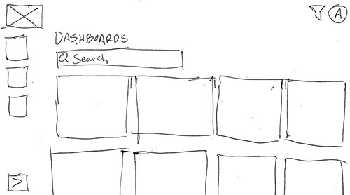
Main Dashboard
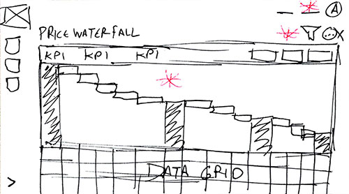
Price Waterfall
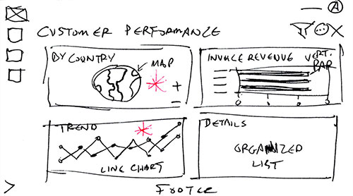
Customer Performance
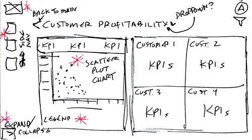
Customer Profitability
The team and I continued to ideate our sketches until they were approved by our stakeholders and subject matter experts. The various iterations of the sketches helped us solidify a favorable, curated format for our dashboards. The next step was to create some wireframes that would follow Steven’s primary task of finding an optimal price for a product after a price adjustment request from Mikael.
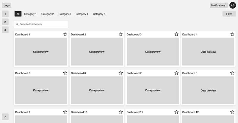
Main Dashboard
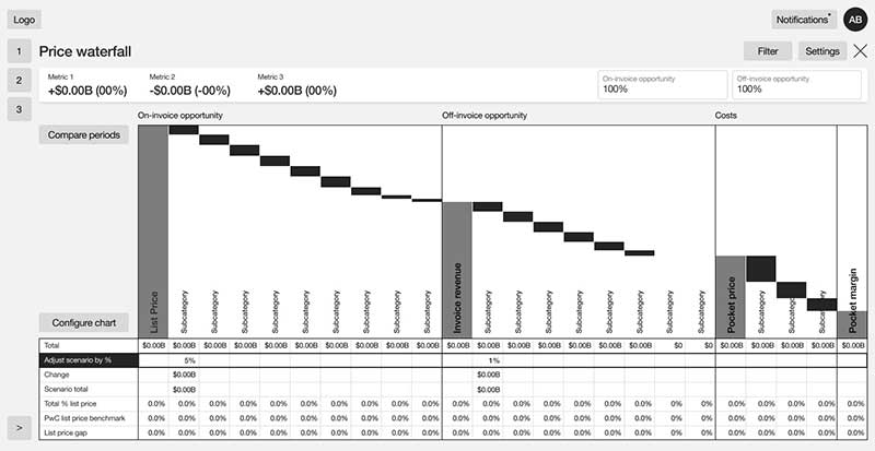
Price Waterfall
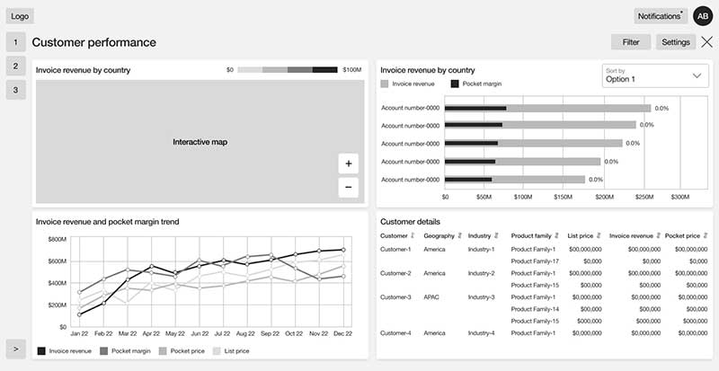
Customer Performance
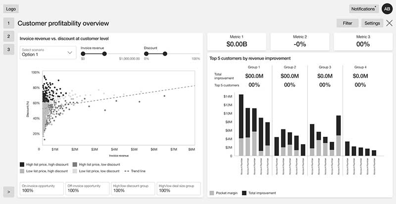
Customer Profitability
Once the wireframes were completed, we put together a low-fidelity prototype that demonstrates a Pricing Lead’s journey to implement a price adjustment request. This prototype would serve as a testing ground for our usability study.
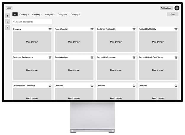
The team and I conducted several moderated live usability studies with stakeholders and subject matter experts fully versed in marketing and price adjustment. We found the most effective method was to use Microsoft Teams to connect with our testers, conduct our interviews, and record their interactions with the prototype. Ultimately, we interviewed and observed 8 participants and spent close to an hour on each session.
We asked all of our testers to find a specific product, make hypothetical adjustments using the Price Waterfall dashboard to find an optimal price, then use several supporting dashboards to confirm their price adjustment.
After wrapping up our interviews and observations, we compiled all of the data and found we had mostly positive results with one big insight:
The testing provided us with some great ways to enhance certain dashboards. Our testers suggested using different types of charts in some instances. Unfortunately, a significant portion of the users were overwhelmed by the number of dashboards on the main page. They didn't know where to start when given a task until they investigated the dashboards further. This insight led to the idea of curating quick start options on the main page in addition to prioritizing the most commonly accessed charts on the main page. This would provide users with an easy way to execute their task.
Testers were easily overwhelmed by the large number of dashboards on the main page, so we designed a Quick Start menu on the left with common tasks based on their role.

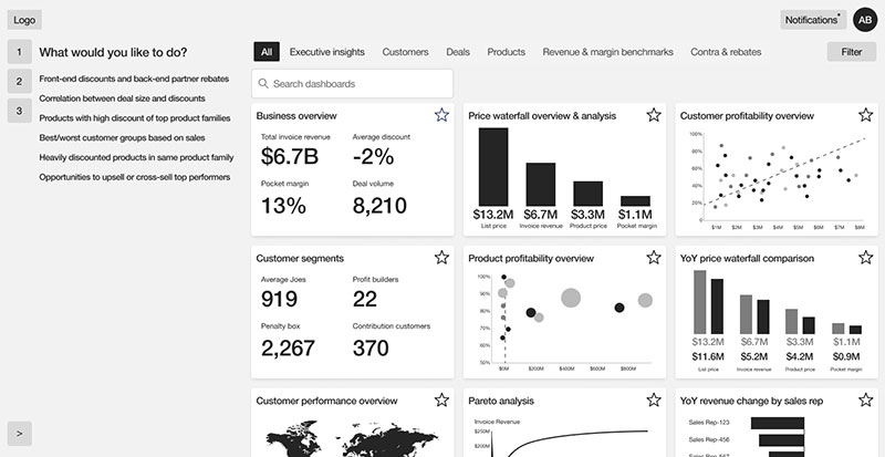
After a successful round of testing, we further developed the design of the dashboards based on the feedback we received, even enhancing the main page with a Quick Start menu. The next step was to make our dashboards come to life with a round of mock-ups.
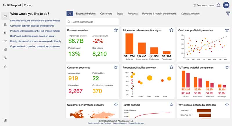
Main Dashboard with Quick Start Menu
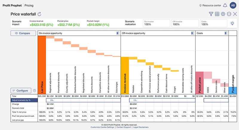
Price Waterfall
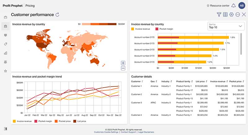
Customer Performance
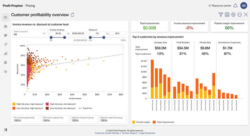
Customer Profitability
The final step before handing off our designs to the development team was to take our high-fidelity mock-ups and create a working prototype, which would be an integral part of future presentations, help us verify the final details with testers, and serve as a visual template for the developers to emulate.
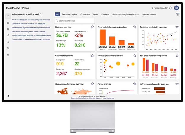

The more options you provide to a user, the more complex the decision-making process becomes for users. Reducing choices to only the essentials reduces confusion and makes completing tasks easier.
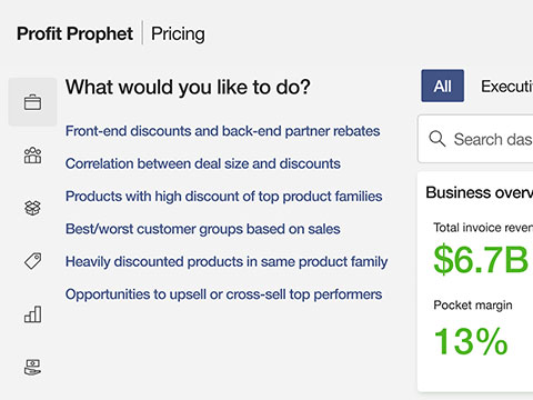
In addition to limiting the number of dashboard options, we provided the users with a Quick Start section to set them on the right path from the very beginning with common tasks.
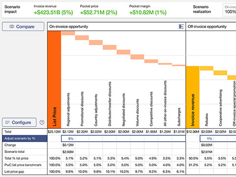
Through the testing and interview process we learned which charts were most ideal for each role and used feedback to make them easier to use. Our robust Price Waterfall chart certainly turned some heads.