 Case Studies
Profit Prophet
Find the right price in seconds — one that balances profit and value.
There's a best price for every product.
Most teams never find it.
The Research
Process


Empathy Map
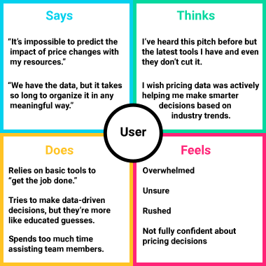 An empathy map helps us establish our personas by finding their voices, feelings, and motivations.
User Pain Points
1. Monitoring price performance
Product teams may be unable to monitor price performance of their products, which restricts their ability to identify the right product mix and explore drivers for low performing products.
2. Data-driven pricing decisions
Pricing teams may not have the right skills or capabilities to make smart, data‑driven pricing decisions.
3. Revenue growth vs. profitability
Leadership struggles with the trade‑off between revenue growth and profitability.
Our Users
Steven, Pricing Lead



“Half my week is spreadsheets and gut checks. I need to know a price is right before I commit to it, not after.”
Steven Brown is responsible for setting pricing strategies that maximize value and align with corporate objectives. His team regularly handles price adjustment requests from Sales.

Goals
- Efficiently handle pricing escalations and price adjustment requests
- Provide pricing team with the proper resources for pricing strategies

Frustrations
- Difficulty determining how pricing decisions will affect the market
- Available systems and tools are insufficient
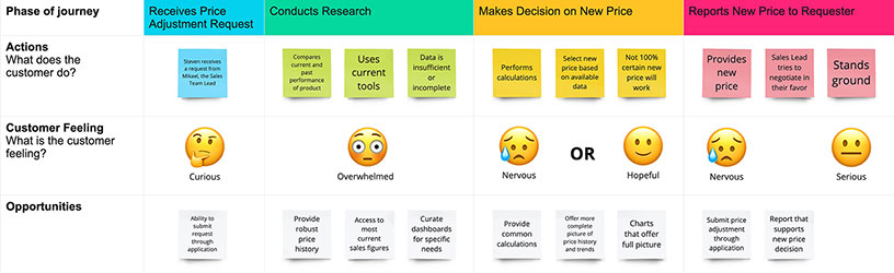
Steven's User Journey
Primary task: Find an optimal price for a product after a price adjustment request.
Michael, Sales Team Lead


“When a deal stalls on price, I can't wait three days for an answer from Pricing. I need to move fast.”
Michael Libera has a high business acumen and is constantly negotiating deals alongside his team. He regularly requests price adjustments from Steven in order to move more product.
Goals
- Work with Pricing Leads to optimize price points and profits
- Understand historical purchasing patterns of customers
Frustrations
- Can't make data-driven decisions without the proper tools
- Many price escalations become short‑term solutions
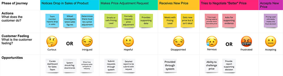
Michael's User Journey
Primary task: Make a price adjustment to a product.
The Story
In order to know what we are going to need to design, we need to illustrate a typical interaction between Michael and Steven.
Ideate: Exploring Opportunities
My team and I assembled an affinity map to organize the results of our competitive analysis into gaps left by the competition and opportunities presented by these gaps.
Affinity Map
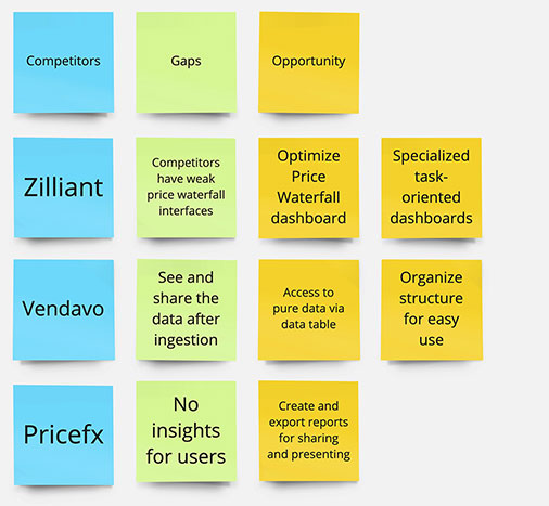 An affinity map is a great way to organize the results of the competitive analysis into opportunities left by the competition.
Top Opportunities
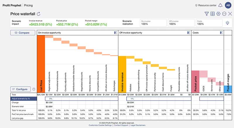
1. Robust Price Waterfall chart
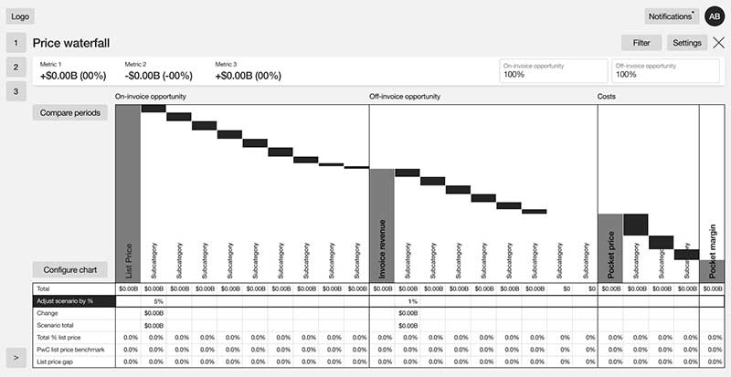
An interactive chart that allows users make hypothetical price adjustments and see their effects in real‑time
2. Direct access to ingested data
Give users a direct line to the underlying data, instead of routing every question through a report request
3. Task‑oriented dashboards
Dashboards built around what each role actually needs to do, not a one-size-fits-all view of every metric
4. Create reports for sharing or presentation
Turn any dashboard view into a polished report ready to share with stakeholders
From Ideas to Sketches to Wireframes
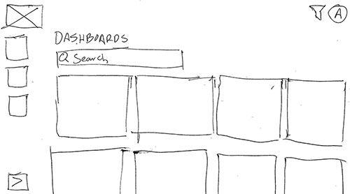
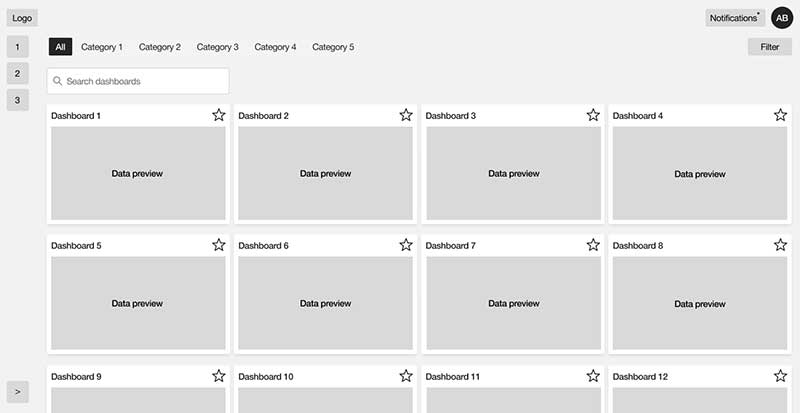
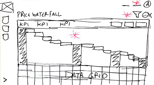
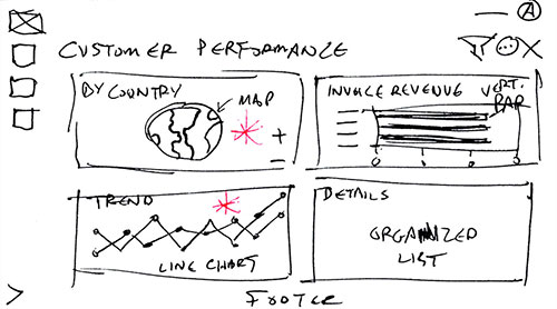
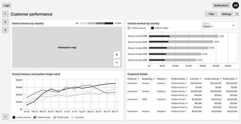
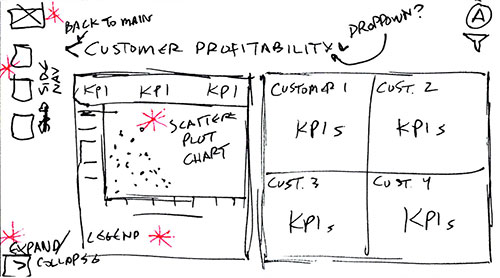
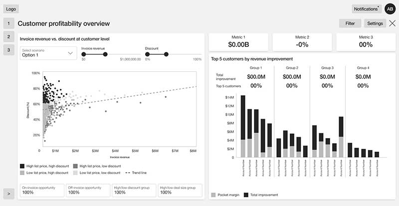
With opportunities identified, we sketched, iterated, and refined wireframes for each dashboard. Since users access the product through a secured VPN on laptop or desktop, those screen sizes were our focus.
Main dashboard

Price Waterfall
Customer Performance
Customer Profitability
Low-Fidelity Prototype & Testing
Observing users interacting with prospective designs is crucial to finding out if the designs work practically.
Summary
After assembling a lo-fi prototype to demonstrate a Pricing Lead's journey to implement a price adjustment request, the team and I conducted several moderated live usability studies with stakeholders and subject matter experts fully versed in marketing and price adjustment.
Tasks
- Find a specific product
- Make hypothetical adjustments using the Price Waterfall dashboard to find an optimal price
- Use several supporting dashboards to confirm their price adjustment
Results
Based on moderated usability sessions with 8 participants via Microsoft Teams (~1 hour each), asking each to act as a Pricing Lead and use the low-fidelity prototype to complete a price adjustment request.
100% successfully completed the provided tasks
Checking the current price in the Price Waterfall chart, making an adjustment, and reviewing the results
100% called the dashboards and charts "very helpful"
Testers noted that "the data is clearly represented" and "useful data for making a price adjustment"
87.5% preferred our dashboards over their current tool
Several testers called it "better designed" and "more thought out" than what they use
75% found the homepage overwhelming —
"I don't know where to start."
Problem
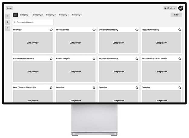
Many users were overwhelmed by the amount of content
The platform had grown to 30+ dashboards, built up over hundreds of prior client engagements — powerful, but overwhelming for anyone encountering it for the first time. They didn't know where to start a given task until they understood the dashboards.
Solution
Curate dashboards by role and create a Quick Start Menu
Work with stakeholders and subject matter experts to prioritize dashboards and find common actions for Pricing Leads, eliminating impractical options. Pricing Leads will have common, repetitive tasks to complete. Provide a prominent list of quick start options to reduce burden of dashboard choices.
Before
The original opening screen offered every dashboard, overwhelming all users with options

After
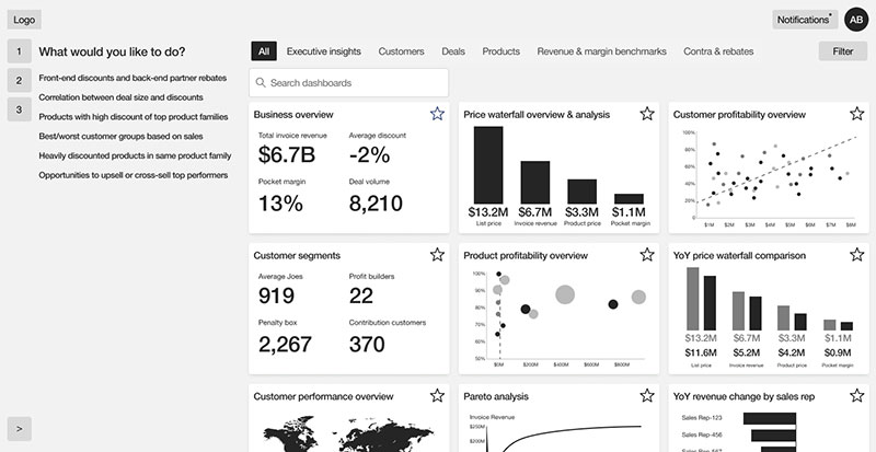 UPDATED: Now the opening screen has a Quick Action Menu that lists common tasks alongside dashboards valuable to the user's role
Retest and Validate Our New Solution
If testing is important, retesting is more important. We conducted another round of interviews and confirmed our solutions. They worked! All test users performed their provided tasks more efficiently and praised the design adjustments.
High-Fidelity Mock-ups
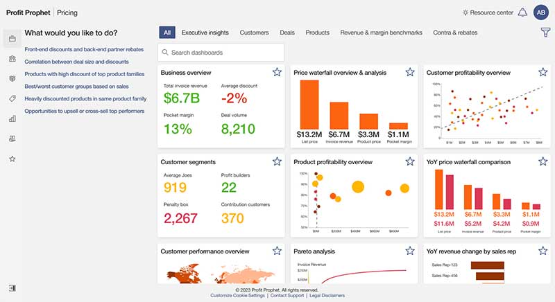
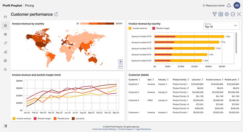
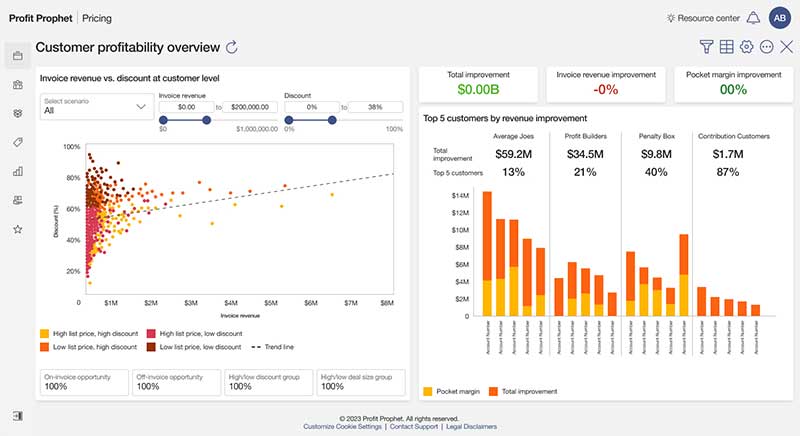
After validating our solutions with users, the next step was to finalize our dashboards and bring them to life.
Main dashboard
Price Waterfall
Customer Performance
Customer Profitability
Final Prototype
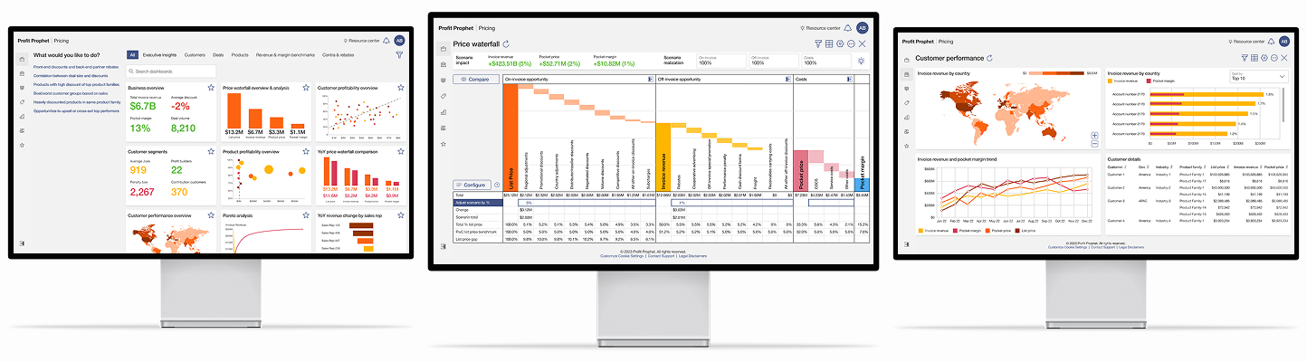
The final step before handing off our designs to the development team was to take our high-fidelity mock-ups and create a working prototype, which would be an integral part of future presentations, helping us verify the final details with testers, and serve as a visual template for the developers to emulate.
Lessons Learned
1. “Too many options” is a real dilemma for users
The more options you provide to a user, the more complex the decision-making process becomes. Providing essential choices reduces confusion and allows user to complete tasks faster.
2. Guide the users
In addition to limiting the number of dashboard options, we provided the users with a Quick Start section to set them on the right path from the very beginning with common tasks.
3. Cater the content
Through the testing and interview process we learned which charts were most ideal for each role and used feedback to make them easier to use. Our robust Price Waterfall chart certainly turned some heads.