 Case Studies
Risk Manager
Resolve compliance issues fast with AI-powered guidance through Process Risk and Controls.
Risk hides in the details most teams don't have time to check
The Research
Process


Empathy Map
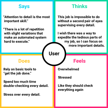 An empathy map helps us establish our personas by finding their voices, feelings, and motivations.
User Pain Points
1. Attention to detail is required
Without high-level discipline and organizational skills, our users are at risk to underperform, cost their organization, or lose their jobs.
2. Regulatory compliance
Industries like finance and healthcare face strict regulations that require scrutinous risk management and control frameworks. Non-compliance could lead to significant penalties.
3. Continuous improvement
PRC frameworks need ongoing assessment and improvements, utilizing audits to refine processes and controls
Our Users
Priya, Process Risk Analyst



"My job is all about the details... and there are A LOT of them."
Priya is responsible for identifying, assessing, and mitigating risks associated with business processes. Her primary focus is ensuring that processes are efficient, compliant, and capable of achieving organizational objectives while minimizing potential risks.

Goals
- Identify, assess, and mitigate risks
- Ensure company is compliant with all industry regulations

Frustrations
- Overwhelming amount of information
- It's hard to identify possible relationships between PRCs
- One mistake could be very costly
- Navigating certain PRCs can be time-consuming and repetitive
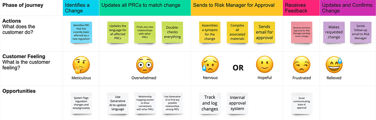
Priya's User Journey
Primary task: Modify a PRC and submit the change for approval.
Jonathan, Sales Team Lead


“One overlooked detail can cost us. I make sure my team never has to guess.”
Jonathan manages a team of Process Risk Analysts, including Priya. An expert on Process Risk Controls (PRC), he has used various tools, but always seems to resort back to tried-and-true methods because of inaccuracies.
Goals
- Overseeing and approving PRCs submitted by his team
- Making sure his team is as efficient as humanly possible
Frustrations
- Relying on outdated and timely tools
- The inevitability of human error
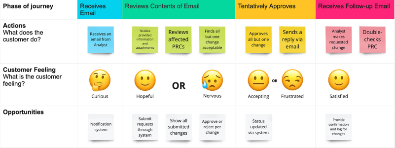
Jonathan's User Journey
Primary task: Review and approve a PRC change submitted by a member of his team.
The Story
In order to know what we are going to need to design, we need to illustrate a typical interaction between Priya and Jonathan.
Ideate: Exploring Opportunities
My team and I assembled an affinity map to organize the results of our competitive analysis into gaps left by the competition and opportunities presented by these gaps.
Affinity Map
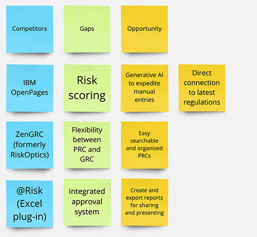 An affinity map is a great way to organize the results of the competitive analysis into opportunities left by the competition.
Top Opportunities
1. Easily searchable and organized PRCs
Let users find any Control or Process in seconds, instead of digging through spreadsheets or shared drives
2. Direct access to latest regulations
Surface current regulatory requirements directly in the workflow, instead of routing users to outside reference material
3. Create and export reports for sharing and presenting
Turn any view into a polished report ready to share with stakeholders
4. Utilize Generative AI to expedite workflow
Use Generative AI to trace regulatory changes directly to the Controls they affect, flagging coverage gaps automatically instead of relying on manual review — cutting the time it takes to keep PRCs current.
From Ideas to Sketches to Wireframes
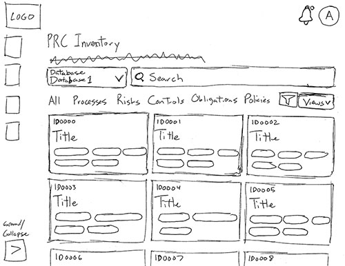
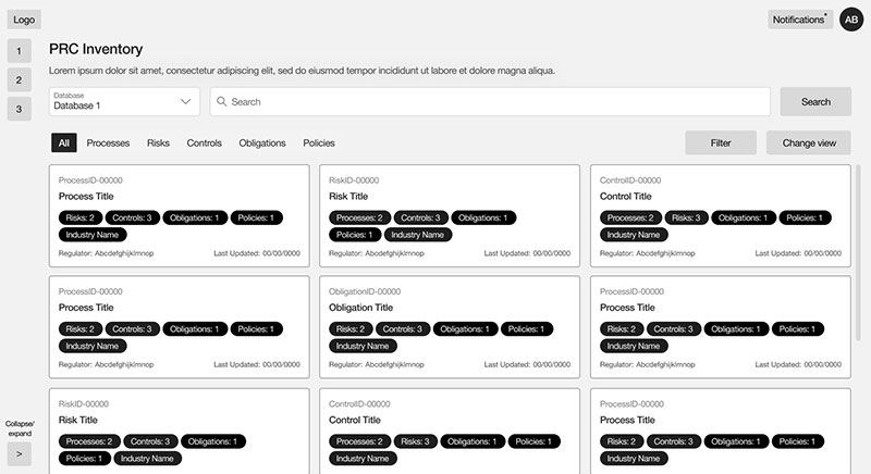
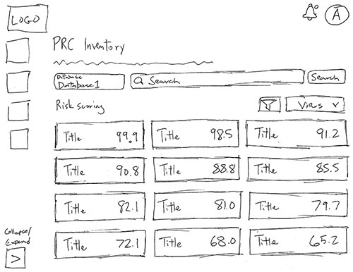
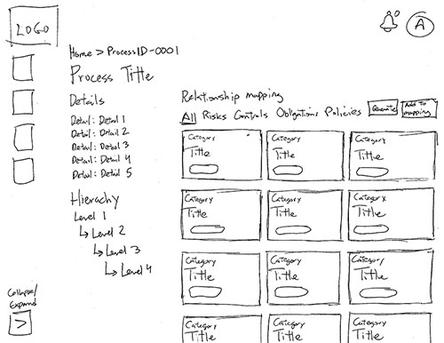
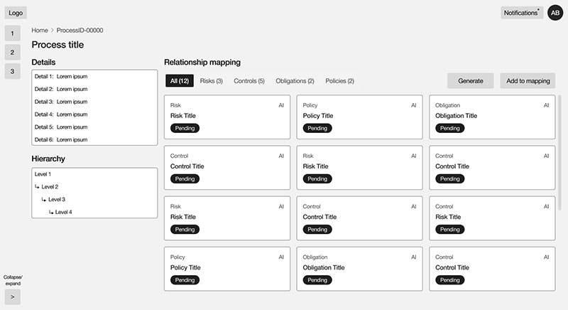
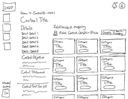
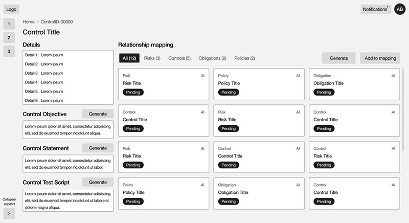
With opportunities identified, we sketched, iterated, and refined wireframes for each dashboard. Since users access the product through a secured VPN on laptop or desktop, those screen sizes were our focus.
Main Dashboard

Risk Scoring

Process Details
Control Details
Low-Fidelity Prototype & Testing
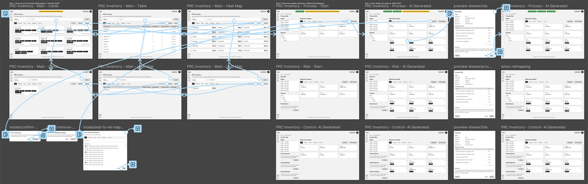
Observing users interacting with prospective designs is crucial to finding out if the designs work practically.
Summary
After assembling a lo-fi prototype to demonstrate a Process Risk Analyst's journey to update a Control, the team and I conducted several moderated live usability studies with stakeholders and subject matter experts fully versed in Process Risk Controls (PRC).
Tasks
- Find a Control
- Update the Control Objective, Control Statement, and Control Test Script
- Submit them for approval
Results
Based on moderated usability sessions with 10 participants via Microsoft Teams (~1 hour each), asking each to use the low-fidelity prototype to find a Control and update its Control Objective, Control Statement, and Control Test Script.
100% completed the task of changing a Control
All testers found the Control and updated its Control Objective, Control Statement, and Control Test Script, noting "the flow works"
100% were confused by the Risk Scoring
All testers assumed high Risk scores were a positive — "Oh, that's bad?!"
80% wanted statements and objectives prioritized
Most testers thought important fields were "tucked away" or "off to the side"
70% said the cards displayed too much information
Most testers were deterred by information in cards — "I just need a short description, the number of Processes and Controls, and the industry name"
Problem #1
Risk Scoring was confusing
The scoring system associated high scores with high risk, a negative indicator. This runs contradictory to most scoring systems where high scores are positive.
Solution #1
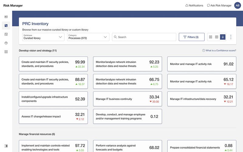
Replace Risk Scores with Confidence Scores
Higher scores are associative with positive results, so we change the concept to higher scores indicating more confidence in that PRC.
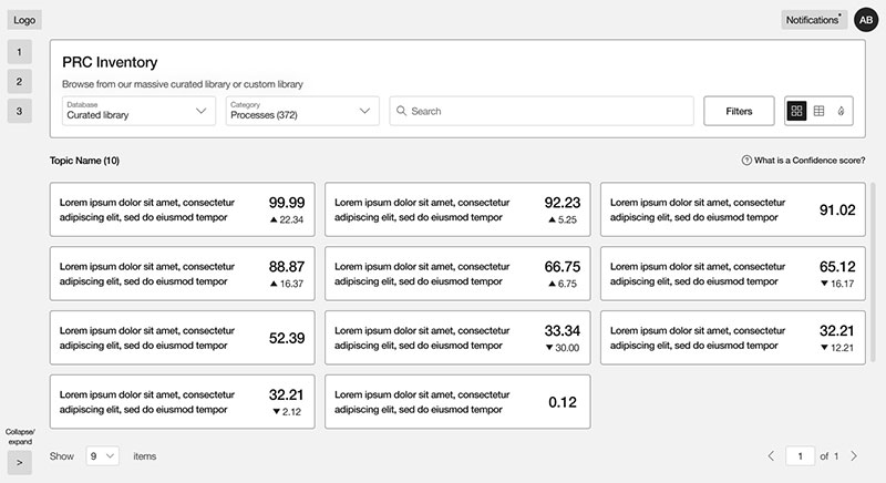 Confidence scores make sense when higher scores are positive.

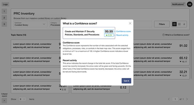 A modal was designed to explain the Confidence scoring system.
Problem #2
Information hierarchy was misaligned
Important Process Risk Control fields like Control Objective, the Control Statement, and Control Test Script needed to be prioritized.
Solution #2
Prioritize Objectives & Statements
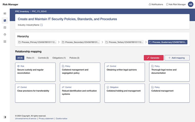
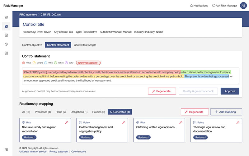
A series of complementary components were created to emphasize these crucial fields and move them higher on the screen.
Before
The left column contained information of various priorities.
After
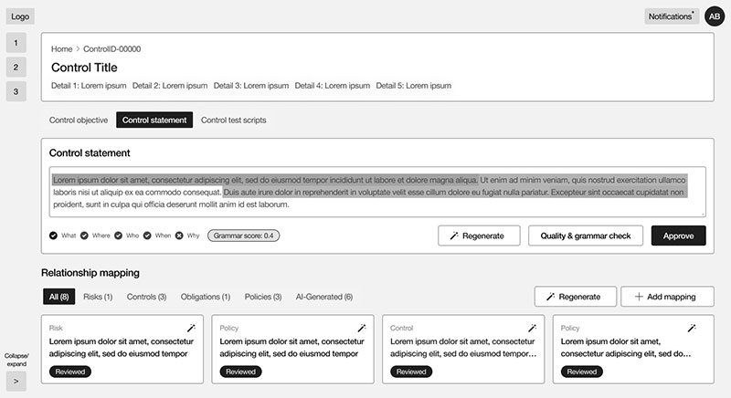 A more useful hierarchy of information for our users.
Problem #3
Cards and tables showed too much information
The platform draws from a repository of 100,000+ regulations, processes, risks, and controls — powerful in scope, but testers found unnecessary data surfacing within each card and table.
Solution #3
Streamline cards and tables
After collaborating with PRC experts, we reduced the information within the cards and tables to only essential information. Also, we removed the tab component and streamlined the search component to allow filtering by category.
Before
The cards were loaded with unnecessary information.
After
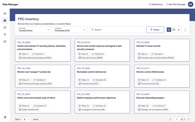
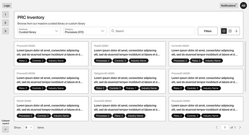 With only required information in the cards and a streamlined search component.
Retest and Validate Our New Solution
If testing is important, retesting is more important. We conducted another round of interviews and confirmed our solutions. They worked! All test users performed their provided tasks more efficiently and praised the design adjustments.
High-Fidelity Mock-ups
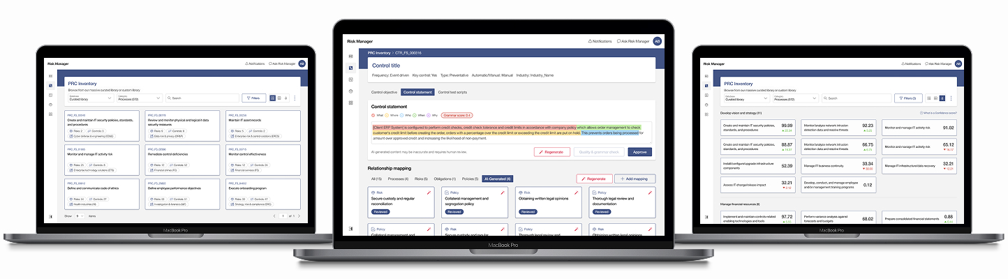
After validating our solutions with users, the next step was to finalize our dashboards and bring them to life.
Main Dashboard
Risk Scoring
Process Details
Control Details
Final Prototype
The final step before handing off our designs to the development team was to take our high-fidelity mock-ups and create a working prototype, which would be an integral part of future presentations, helping us verify the final details with testers, and serve as a visual template for the developers to emulate.
Lessons Learned
1. Match users' expectations
Risk Scores ran backwards — a high score meant high risk, which felt wrong the moment users saw it. Renaming them Confidence Scores and flipping the scale so higher meant better resolved the confusion instantly, without any change to the underlying data.
2. Surface what matters first
Control Objective, Control Statement, and Control Test Script were the fields users needed most, but they were buried under lower-priority information. Reordering the page around these fields cut the time it took analysts to find what they needed.
3. Trim to the essentials, even for experts
Even experienced Process Risk Analysts were overwhelmed by cards and tables loaded with secondary data. Stripping each view down to only what's essential — and simplifying the search to filter by category — made the interface faster to scan without sacrificing capability.